Page Description
This section describes general pages you might see during application design in free layout.
Select a page in free layout, double-click or point to a block of the page, and then click  at the upper-right corner to start page design.
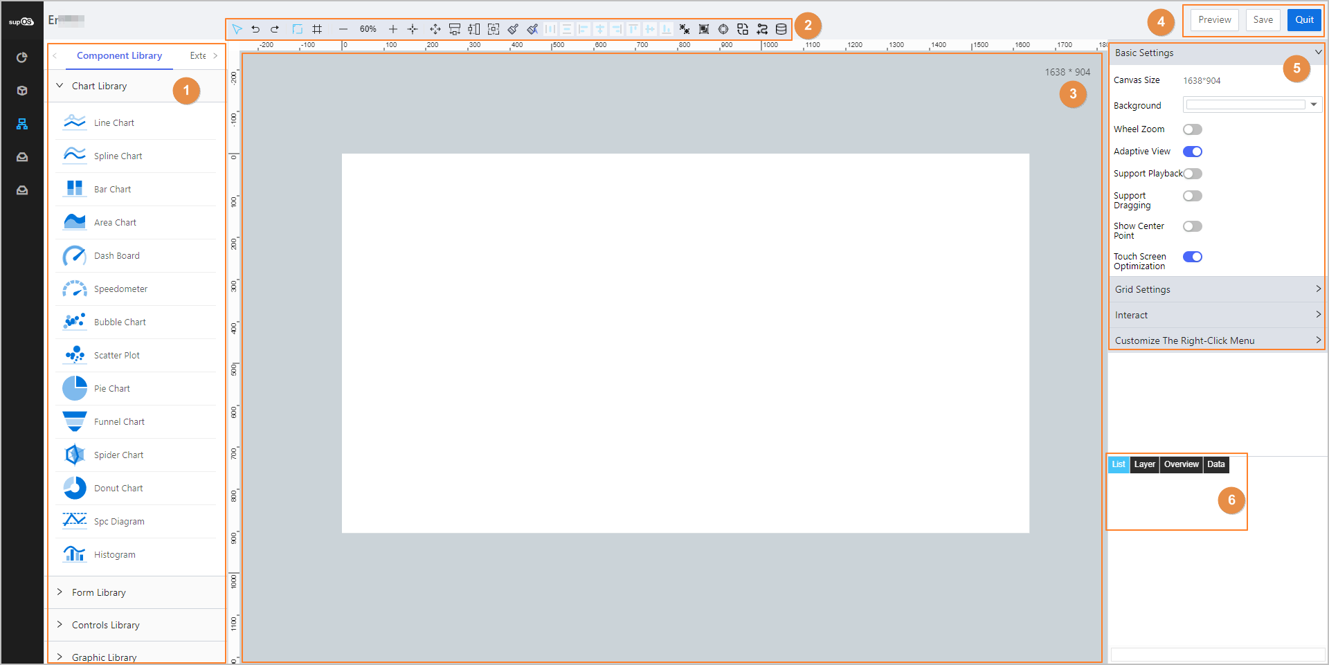
| No. | Module | Description |
|---|---|---|
| 1 | Element Library |
|
| 2 | Development Tools | Displays tools you can use during designing. |
| 3 | Canvas | The place where you design your application. |
| 4 | Page Operations | Preview and save the current page and exit page designing. |
| 5 | Property | Set canvas properties to achieve effects you need. |
| 6 | Page Functions | Select elements, change element relations, view page effect and edit elements. |
Creating Element Template
The business designer provides general elements and extension elements for secondary development. You can save your design as templates for future use. The saved templates are under Extension Library.
General elements contain libraries such as chart, form, controls and graphics. For details, see Element Details.
- On the new page in free layout you created, double-click or point to a block of the page, and then click at the upper-right corner to start page design.
- On the left side, select an element, and then click on the canvas to place the selected element.
Drag on the canvas to set the size of the element.
- (Optional) Add folders for your templates.
- Click the Extension Library tab, select Custom Template from the drop-down menu.
- Click
 on the bottom.
A new folder is created. You can point to the folder, click to set a name on the pop-up window.
- Right-click the element on the canvas, and then click Save As Template.
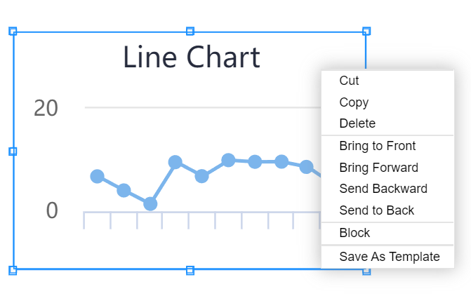
- Set the name and location of the template.
You can download or upload templates by clicking the corresponding icons on the bottom of Custom Template section.
Development Tools
Tools on top of the page provide various options for block design.

| Icon | Description |
|---|---|
 | Click the icon and then click elements on the canvas to select them. |
 | Go back to the last step or go to the next. |
 | Display or hide the scale. |
 | Display or hide the grid. |
 | Adjust the canvas size. |
 | Display the whole block on the canvas or display the block in full screen. |
 | Press the ctrl key and select multiple elements, and then make them the same width, height or same size. |
 | Enable format brush or dynamic format brush, and then select elements to make them the same format. Only available for graphic elements. |
 | Select three or more elements, and arrange them horizontally or vertically equidistant. |
 | Select two or more elements, and change their alignment. |
 | Ungroup or group the selected elements. |
 | Check connections of all tags on the current page. |
 | Find and replace. |
 | Add data link controls in batches. |
 | Search for dynamic data sources related to the current page. Data sources bound with graphic elements are excluded. |
- Check tags connection.
- Click , and then click Start Checking on the pop-up window.

- (Optional) Click Edit next to errors after inspection, replace the data source and then check again.info
- The inspection is over is displayed when the connection is normal.
- No results are displayed when there is no bound data source.
- Find and replace.
- Click , and then enter content you want to find or replace in the pop-up window.info
Data link controls are not available for text replacement.
tipYou can also click
 in the textbox to select a tag or property to be replaced.
- Set filters as needed and then click Find.
- Set the replacement using the same method as Find Content.
- Click Replace Preview to view the effect, select the found object, and then click Replace Selected.
- Add datalink controls in batches.
- Click , and then click Add Object Properties to select properties.

- Set the display of selected properties on the canvas, and then click Confirm.info
When the set Integer Digits are more than that of the selected data, the data will be compensated with 0. If less, the data will be displayed as it is. For example, the data is 352.69, Integer Digits is set to 5, the data is displayed as 00352.69. If Integer Digits is set to 2, the data is displayed as 352.69.
- Find and replace data sources.
- Click , enter keywords, and then click Search.info
Select a result, the corresponding element is highlighted on the canvas.

- Click
 next to the data source, and then select another data source to replace.info
You can also directly enter a data source name following the naming rules similar to
system:Template_550:Instance_551:system:Property_554. - Click Confirm.
Canvas Property
You can set properties of the canvas and elements on it. This section focuses to the canvas property.
For details on element properties, see Chart Overview.
Click an empty space on the canvas, its property list is displayed on the right.
- Basic settings
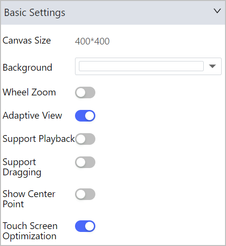
| Parameter | Description |
|---|---|
| Canvas Size | Displays the canvas size set during block layout settings. If the block is Flow Layout, you can change its size, and if it is Free Layout, the size is fixed. |
| Background | Edit the block background color. |
| Wheel Zoom |
|
| Adaptive View |
info Only available for free layout. |
| Support Playback | Enable it, and then you can playback data in operation center by right-clicking the page and selecting playback. info Make sure datalink controls are added and History is enabled. |
| Support Dragging | Set whether you can drag the block in operation center. info It is disabled in flow layout and enabled in free layout by default. |
| Show Center Point | Set whether to display the middle point of elements. info We recommend hiding the middle point to avoid moving it during dragging. |
| Touch Screen Optimization | Set whether to optimize the page display on touch screens. |
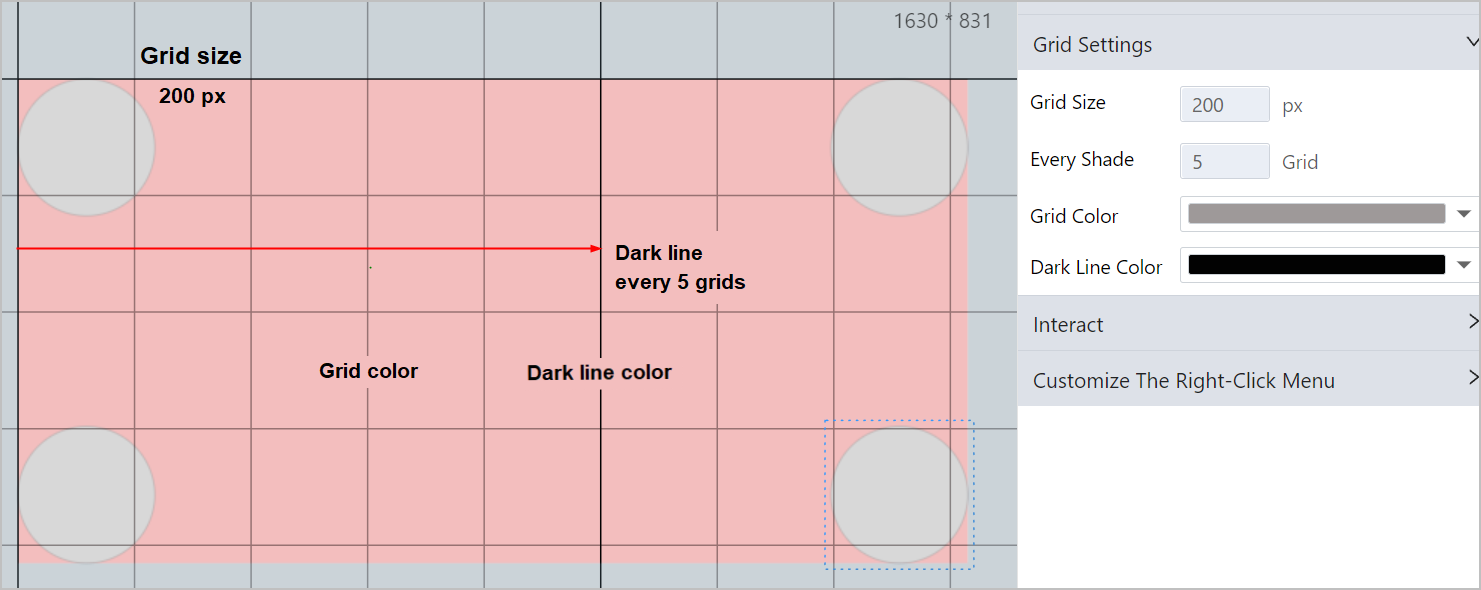
- Grid settings
Set Every Shade to 5, and the grid line switches between Grid Color and Dark Line Color every 5 grids.
- Interact
You can add, configure and delete interaction events.
- Click the drop-down list, and then select an event.
Event Description Page Initialization Interactions during page initialization. Content Changing Interactions triggered when the current block content changes. Content Loading Interactions triggered when the current block is loading. Get Data-Work Flow Get data of the last node on the workflow. Workflow Submit Data Interactions triggered when submitting workflow. Workflow Reject Data Interactions triggered when workflow is rejected. Select Interactions triggered when selecting the current block. Click Interactions triggered when clicking the current block. Double-click Interactions triggered when double-clicking the current block. Get Focus Interactions triggered when pointing to the current block. Lose Focus Interactions triggered when the cursor leaving the current block. Upload Complete Interactions triggered when upload is complete. - Click Settings, set interaction events.
When set the event to Open Link, you can set to open it in different types of pages or windows and enter link information. You can also set the event to Close The Window or manually write script for the event.infoAll custom scripts in Business Designer provide detailed error notifications when errors happen in preview or operation center, including page name, error control,script event name and error information.

- Click Finish.
- Customize the right-click menu
- Click Add new options.
- Set the event.

- Click Confirm, and the menu will be added to the right-click menu list of the canvas in operation center.
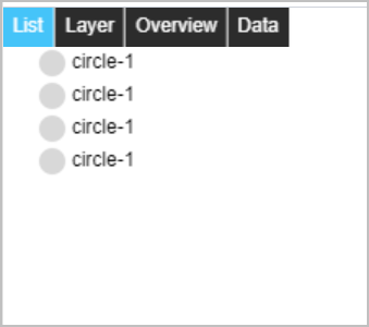
Page Functions
You can select elements by name, change element relations by dragging, view page effect with all elements and edit elements by manually changing scripts.
| Parameter | Description |
|---|---|
| List | Select elements by clicking on the name from the list. |
| Layer | Drag elements up and down to change their relations. |
| Overview | View the effect of all elements globally. |
| Data | Add, delete, edit properties, configure or change positions of elements through codes. |